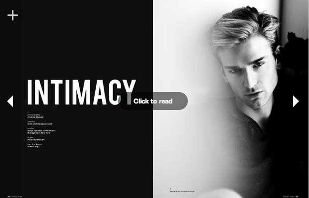
We decided to have our magazine in a landscape page orientation as we felt it represented the theme of our magazine which is helping the landscape with recycling clothing. The landscape orientation represents how we want to protect the landscape by stopping waste in the fashion industry. Digital magazines often come in both portrait and landscape this is what inspired us to create our magazine in landscape. This is some examples of online magazines that come in landscape orientation:
Showing posts with label The Commission. Show all posts
Monday, 21 May 2012
Sunday, 20 May 2012
The Commission- Self Evaluation
What we learnt
Throughout the task we learnt many new skills including how important research is before starting the publication, researching is vital especially when thinking about layout, format and narrative. Through the research we all done we now can understand the particular visual methodology magazines chose in order to understand how it creates its particular narrative, this was an important aspect when thinking about narrative for our publication. InDesign was a tool we used to help create our fashion magazine. The desktop publishing application gave us pixel- perfect control over designs, photos and typography, and helped create elegant and engaging pages for print, tablets, and other screens. From using this program, we have learnt how to design and create a magazine.
Labels:
The Commission
The Commission- 'Trash Fashion' Pages
Concept
Makes a statement about fast throwaway fashion, Looks at how people would rather spend money on new clothes rather then repair or recycle there own clothing,
These images make a statement about fast throwaway fashion and how people would rather spend money on clothes that do not last very long than repair or even recycle their clothes and save themselves money.Page layout & Style
We decided to place three images on a double page spread to make the page visually appealing and as we have used the number three throughout the magazine. We decided to use the images twice to make represent recycling.
Article
'Taking textiles out of landfills' Discusses how the fashion industry are one of the largest creators of waste, Talks about companies who have launched recycling programs,
The article we choose to go with the pictures discusses how the fashion industry are one of the largest creators of waste, this suits the pictures as they show clothing made out of waste materials.
Labels:
The Commission
Saturday, 19 May 2012
The Commission- Recycled Jewellery
- Concept
Jewellery made from car parts, Shows how something that was once considered waste could be
recycled and remade into something beautiful. Jewellery is photographed in a modern way which
will appeal to our target audience.
In our magazine five page have been dedicated to recycled jewellery. We included six images, three of them are of a mannequin with different necklaces on it made from car parts, the other three are of a model wearing the recycled jewellery. The images look at how something that was once considered waste could be reused to make beautiful items. The jewellery has been photographed in a way that makes it appear very desirable because of the modern styling and the way the model is posed which will appeal to our target audience and will encourage the audience to recycle.
- Page Layout & Style
Overlapping text over image in the style of David Carson, Positioned the images in the style of Posititve magazine, Simplistic pages so all attention is on the jewellery and to give the magazine a modern feel, Black and white colour scheme on text page,
We wanted to keep the pages simplistic so all the focus is on the recycled jewellery to show its importance and to encourage the audience to make jewellery out of unwanted items. Positive magazine inspired us with how they lay there images out, there use of space and the way they make sure the images are spread out equally. We decided to place three images on two of the double page spreads as three is an important number in design and makes everything visually appealing. The first page of this article has been designed so it starts of as black and then goes to white to make the pages merge with the rest of the magazine so it looks professional. We used black and white font on the first page as we was inspired by Stefan Sagmeister and how he uses black and white text on one design which makes it stand out.
- Article
'Recycled Jewellery Makes Beautiful, Unique Gifts', Discusses eco friendly jewellery made from waste materials, The article suits the images as they are of jewellery made from car parts,
We felt that the article 'Recycled Jewellery Makes Beautiful, Unique Gifts' suited the photographs of jewellery made from car parts perfectly. The article encourages the reader to make jewellery made from waste products and discusses how it has been made fashionable to make eco friendly jewellery.
Labels:
The Commission
The Commission- Fashion Editorial
Design- Consume- Use by- Discard (Repeat)
Concept
The Concept behind this fashion editorial is to show how fashion designers now make clothes that only last for a short period of time as there is always new trends and therefore there is always waste in the fashion industry. The photographs represent how consumers act like the fashion industry's mannequin and just like clothes has a use by date which is why the model has been portrayed as a mannequin thrown out into the rubbish. The title 'Design- Consume- Use by- Discard (Repeat)' represents the way fashion industry treats there clothing and the consumers.
Page Layout & Style
We decided to keep the rest of the page plain so all your attention is on the photographs and the important issue they show about waste in the fashion industry. Positive magazine inspired us with the way they lay there images out in editorials, by keeping every picture the same size and in the same place on each page adds a repetitive feel to represent the way we as consumers are treated all the same and as mannequins. Typographer and designer Erik Spiekermann inspired us with one of his typefaces where he lengthens and makes the lettering closer together, we liked the way it made the text stand out and how it made it look very powerful.
Concept
The Concept behind this fashion editorial is to show how fashion designers now make clothes that only last for a short period of time as there is always new trends and therefore there is always waste in the fashion industry. The photographs represent how consumers act like the fashion industry's mannequin and just like clothes has a use by date which is why the model has been portrayed as a mannequin thrown out into the rubbish. The title 'Design- Consume- Use by- Discard (Repeat)' represents the way fashion industry treats there clothing and the consumers.
Page Layout & Style
We decided to keep the rest of the page plain so all your attention is on the photographs and the important issue they show about waste in the fashion industry. Positive magazine inspired us with the way they lay there images out in editorials, by keeping every picture the same size and in the same place on each page adds a repetitive feel to represent the way we as consumers are treated all the same and as mannequins. Typographer and designer Erik Spiekermann inspired us with one of his typefaces where he lengthens and makes the lettering closer together, we liked the way it made the text stand out and how it made it look very powerful.
Labels:
The Commission
Thursday, 17 May 2012
The Commission- Page layout of my images
'Fast Fashion' Magazine article and images
- Concept
The title of this article and images is called 'Fast Fashion'. We decided on this name as my images looks into mass consumption in the fashion industry and how buying second hand clothing should be encouraged. My images are in the style of a collage, by placing my images with cut outs from old magazines demonstrates how you can recycle fashion in more then one way, the receipts I used represent the mass consumption in the fashion industry as I have used a lot of them in my work.
- Page Layout
For the page layout we was inspired by Positive magazine and how on one of there pages they repeat some of there images, we decided to use this technique on this page as it symbolises the images being recycled and reused. The images had a black background so we decided to make the whole page black as we noticed it was often used in Positive magazine and made the pages stand out. To merge the plain white pages in with the black, we began and ended the article pages with a black strip on a white page so the magazine flows together. We decided to line up the images so they were all the same size so that they are in the style of pictures from Positive magazine. Too add interest to the page we made the images start from a different side on each page.
- Article
The article we choose to go with the images is called 'Yes- even clothes can be recycled', which discusses how Americans are buying and getting rid of clothes quicker then ever and how there are more options besides throwing away clothing such as charity shops. The article suits the theme of our magazine as it talks about how recycling helps the environment and encourages the audience to recycle there clothing. We decided to have the text in white so it contrasts against the black background which makes it stand out and as to match the colour scheme of the rest of the magazine.
Labels:
The Commission
The Commission- Back Cover
Our idea for the back cover was to use the same images as we used for the front cover so it’s as if the reader has done a full circle to represent recycling. The repetition of the images symbolises recycling and upcycling to give the audience an impression that they are recycling the magazine by going back to the beginning. This idea was inspired by the back pages in Positive magazine as they look very similar to the front cover and look as if they could be the front page of the magazine. On Photoshop I made the front cover by applying four of the same images to a blank A4 page, two were in colour and the other two were in black and white to make the page stand out. To make the back cover slightly different I flipped it horizontally on Photoshop.
Labels:
The Commission
The Commission- Idea's for name of magazine
To gain inspiration on what we could call our magazine I looked in a thesaurus to see what words are associated with recycling as all of our images deal with the issue of recycling in fashion.
recycling:
- convert
- reclaim
- recover
- reprocess
- salvage
- save
- reuse
Other names I thought of are:
- Eco
- Environmental
recycling:
- convert
- reclaim
- recover
- reprocess
- salvage
- save
- reuse
Other names I thought of are:
- Eco
- Environmental
Labels:
The Commission
The Commission- Introduction
Presentation Introduction
- Theme
Fashion magazine showcasing recyled and upcycled fashion, stopping mass consumption
in the fashion industry, encourages audience to recycle and upcycle clothing.
We decided to come together as a group because all of our images looked into waste in the fashion industry and how the problem could be solved. Each group members images was all fashion based so we decided we wanted to create a fashion magazine showcasing how you can still be fashionable and environmentally friendly at the same time. The concept of our magazine is to encourage clothing recycling and upcycling to help to stop mass consumption in the fashion industry.
- Name of magazine, ‘Eco’
Identifies theme of magazine, can easily be remembered, modern, the recycling logo can
be used in place of the ‘o’ to represent recycling,
We choose the name 'eco' for our magazine, with the recycling logo in place of the o, this is so the audience are aware that the magazine is about recycling as the name identifies the theme of our magazine. The name is short so it can easily be remembered and is modern as it is popular for fashion magazines to gave a short name.
- Positive magazine
‘Different views around the world’
One of our main references was Positive magazine which is a online magazine published every six months. They describe the magazine as ' Positive Magazine speaks about photos, stories, reportages, every fragment that tells what's happening in the world through different points of view' . We liked how the magazine deals with topics that are happening in the world as we want our magazine to deal with recycling in the fashion industry. We liked the modern feel the magazine had and how they use different page layouts throughout the magazine.
- Target Audience
16- 30, focus on the next generation to encourage recycling so they start from a young age,
The target audience for our magazine is beween16- 30 years old we wanted to focus on a younger audience as they are the next generation so it's important to get them thinking about recycling clothing from a young age.
- Style
Modern, minimatlistic, powerful
The style of a magazine is modern so the magazine will appeal to the young target audience, and it is is also minimalistic so all your attention is kept on the images showcasing how fashion can be recycled. Throughout the magazine is the recycling logo on the top of every left page, we was inspired by Positive magazine and how they have a plus sign running throughout there magazine.
Labels:
The Commission
The Commission- Front Cover
Front cover
We wanted the front cover on our magazine to stand out and catch the audiences eye. The front cover of 'Vnfold' magazine inspired us with how they have layered images on top of each other which makes the cover look very eye catching. The photography and art direction is by Antonella Arismendi, we liked the minimalistic feel of the images and how there is no text on the cover apart from the name of the magazine. The idea of layering images on top of one another represents the idea of recycling and how we are making sure we use all of the images and nothings going to waste. We are going to make the images spread across the whole of the page to show how we are not wasting space on the paper to go with the theme of having no waste in fashion. The images we decided to go on the front cover are by Katie Joiner, they are very powerful images and appear very modern with the models poses and styling. We also decided to use these particular images as the model is wearing necklaces made from old car parts which represents the magazines theme of recycling and upcycling clothing. We wanted the front cover to look very minimalistic to make the image and the title of the magazine the main focus so we choose not to include any other text apart from ‘eco’ the magazines name. Front covers by magazines Elle and Blend inspired us to design a minimal front cover.
We decided to use this image as the front cover as we liked how the model is looking directly at the audience which gives the image a dramatic feel. I experimented on photoshop with different ideas we could use for the front cover. First I changed one of the images to black and white and applied the image twice to an A4 document, I liked the repetition of the image however I didn't think it was strong enough. With the next image I kept the same two black and white images as before but this time I applied the same image in colour twice to the photo and placed them on top of the other images. This made the cover much more powerful however I didn't like how the images were repeated again with exactly the same technique so I made one of the background colours to colour and changed the image placed on top of it to black and white.
This is our final front cover for our magazine :
Labels:
The Commission
Wednesday, 16 May 2012
The Commission- Artist Research for Magazine
Stefan Sagmeister
Sagmeister is a graphic designer and typographer. He has designed album covers for artist such as Aerosmith, The Rolling Stones and OK Go. He has also worked for many magazines since the age of 15. Now he designs packaging, branding, graphics and books. From looking at his work it made me realise how important typography is as in graphic design, and how it can change the whole feel of the image. Sagmeister's work inspired me for our magazine with how he layers text on top of his images and with his use of different type fonts.
David Carson
David Carson is also a graphic designer who mostly works on magazine design and typography. His work was described as being 'grunge typography', some of his images look as if the have been ruined purposefully, he also places text on images the same way by having missing letters and having them all placed unevenly.
He also designs pages in magazine where the images and text look as if they are on the same level as the text is almost as big as the picture and overlaps it, I found that this technique makes the images stand out and want to use it in our magazine.

Neville Brody
Neviller Brody works as a Art director, graphic designer and typographer. He has worked on many magazines such as The Face and Arena and also designed album covers for artists such as Depeche Mode. The way he designs the text so larger fonts is mixed in smaller fonts makes certain words stand out and grab your attention this is a technique we could use in our magazine. I also find it interesting with how he uses a black and white colour scheme with often one bright colour as it attracts your attention to the page.
Sagmeister is a graphic designer and typographer. He has designed album covers for artist such as Aerosmith, The Rolling Stones and OK Go. He has also worked for many magazines since the age of 15. Now he designs packaging, branding, graphics and books. From looking at his work it made me realise how important typography is as in graphic design, and how it can change the whole feel of the image. Sagmeister's work inspired me for our magazine with how he layers text on top of his images and with his use of different type fonts.
David Carson is also a graphic designer who mostly works on magazine design and typography. His work was described as being 'grunge typography', some of his images look as if the have been ruined purposefully, he also places text on images the same way by having missing letters and having them all placed unevenly.
He also designs pages in magazine where the images and text look as if they are on the same level as the text is almost as big as the picture and overlaps it, I found that this technique makes the images stand out and want to use it in our magazine.

Neville Brody
Neviller Brody works as a Art director, graphic designer and typographer. He has worked on many magazines such as The Face and Arena and also designed album covers for artists such as Depeche Mode. The way he designs the text so larger fonts is mixed in smaller fonts makes certain words stand out and grab your attention this is a technique we could use in our magazine. I also find it interesting with how he uses a black and white colour scheme with often one bright colour as it attracts your attention to the page.
Labels:
The Commission
Tuesday, 15 May 2012
The Commission- Role's and Responsibilities
I devided the presentation up into sections so everyone knows what they have to write and what there is to do. I made sure I divided everything up equally.
- Research into two visual references (Graphic designer, Artist, Typography, Photographer who deal with magazines)
- Research fashion articles we could include
- Discuss the magazines name.
- Explain how your own work is shown (text, layout of page, choice of images, image size,relationship to text or relationship of images to one another)
- Write introduction (A clear introduction to your proposed publication choice, outlining the concept, behind your choice.)
- Discuss choice of landscape page orientation
- Identify the roles and responsibilities
Katie
- Research into two visual references (Graphic designer, Artist, Typography, Photographer who deal with magazines)
- Research into positive magazine.
- Explain how your own work is shown (text, layout of page, choice of images, image size,relationship to text or relationship of images to one another)
- What has been the most significant challenge regarding this task? How can you overcome them in the future?
- How have you managed this task of the unit? Josie
- Research into two visual references (Graphic designer, Artist, Typography, Photographer who deal with magazines)
- Discuss cover choice (Reference is on Facebook)
- Explain contents page
- Explain how your own work is shown (text, layout of page, choice of images, image size, relationship to text or relationship of images to one another)
- What could you have done better or what needed more consideration?
Sophie
- Research into two visual references (Graphic designer, Artist, Typography, Photographer who deal with magazines)
- Explain how your own work is shown (text, layout of page, choice of images, image size,relationship to text or relationship of images to one another)
- Explain why we picked positive magazine and not the other two magazines.
- Talk about the sequencing of images and the experience this creates for your audience
What have you learned?
- Discuss how we worked together as a team as well as individuals.
Luke
- Research into two visual references (Graphic designer, Artist, Typography, Photographer who deal with magazines)
- Explain how your own work is shown (text, layout of page, choice of images, image size)
- References from fashion magazines ( Scan magazines- look at text, layout)
- Important factors we have learnt from research
- How have the particularities of your chosen publication output influenced your own choices
Labels:
The Commission
Monday, 14 May 2012
The Commission- Contents Page
Contents Page & Text page
Research for contents page:
Research for Text page:
Research for contents page:
- Concept
Text on the left page lets the audience know what is represented in the magazine, Contents page allows the audience to see whats in the magazine and lists photographers names, Contents page points you to the right direction.
We decided to include a contents page in a our magazine so the audience can navigate through the magazine easily. It also shows the audience what is included in the magazine and who are the photographers are. On the opposite page to the contents we placed text on to a blank page of words that are associated with our magazine to show the audience what our magazine is about.
- Page Layout & Style
Used images of arrows to link to recycling logo, Three arrows as three is a recurring theme throughout the magazine, Black and white to match magazines colour scheme, Modern,
Graphic designer Neville Brody was our main influence for this page, we liked how he used images and text to create interesting designs with his revolutionary use of shape and form. A page were he used arrows as text boxes influenced us for our own magazine as they reminded us of the recycling logo. We also felt the use of arrows would make the page stand out which will grab the publics attention. For the contents page we decided to use a black and white colour scheme to give the page a modern feel and so the page matches the rest of the magazines colour scheme. The page before the contents was inspired by Positive magazine, on one page it was full of text we liked this idea and decided to use it to tell the audience what our magazine consists of.
- Text
Vertical text inspired by positive magazine and Neville Brody, Made the text stand out by having black text against a white background, Included a brief description about each article,
Positive magazine and designer Neville Brody inspired us to put some text vertically to add interest to the page and to create an impact. In the contents we added a brief description of the pages so the audience can see what each section of the magazine is about and can easily navigate through it. We choose to have the text in black so it stands out against the white arrows.
Research for Text page:
On the opposite page to the contents we placed text on to a blank page of words that are associated with our magazine to show the audience what our magazine is about. The page before the contents was inspired by Positive magazine, on one page it was full of text we liked this idea and decided to use it to tell the audience what our magazine consists of.
Labels:
The Commission
The Commission- Environmental Magazines
I looked into magazines that focus on environmental issues as all of our images deal with recycling or up cycling.
http://issuu.com/search?q=recycle
Labels:
The Commission
The Commission- Idea's for magazine
- Images at top of page
- Images placed at the bottom of page
- Title of article covering one whole page
- Using the whole page as an image
I like the idea of using the whole of the page for an image as if to say we are not wasting the paper and are recycling...
- Repititon of images.
- Black backgrounds, match images
-Text on double page
- Collage, the images have been placed in a collage style where they are layered on top of each other.
Labels:
The Commission
Subscribe to:
Posts (Atom)