Sunday 25 March 2012

The Commission- Critical Appraisal


Critical Appraisal
My idea for 'The Commission' project is too focus on recycled fashion. I came up with this idea after I researched into statics of waste in Medway, they showed that Recycling in Medway is there biggest problem concerning waste. After researching into recycled clothing, I became interested in how recycling garments can help the environment in many ways as it helps with the problem of mass consumption in the fashion industry. I also became interested in how you can recycle fashion in more different ways then just buying from second hand clothing stores.


 First I looked into photographers/artists that deal with consumerism and consumption, to gain inspiration on how I could represent this in my work. Photographer Chris Jordan inspired me to use many different pieces of recycled clothing in my work as he uses scale and mass to show the amount of consumerism that happens around the world. Sylvie Fleury inspired me for my work as she explores the satisfaction people get from shopping for clothing, I like the way she makes her images appeal to a female audience by focusing on fashion and by making her objects seem desirable which is what I want to achieve in my images. 


Next I began looking into photographers that use second hand clothing in there work, I became interested in the idea of the clothes telling a story as they once belonged to someone else and how they have more meaning and story to them compared to clothes bought from a regular clothing store. Photographer Siri Kivisto inspired me with the way she layers clothing on the subject to show the relationship between an item of clothing that is no longer a treasured object. The photographers I looked at all archive pieces of clothing which appealed to me as it archives the importance of clothing and how we should look after them. Dann Treacy inspired me with the way he layers clothing that belongs to other people on a model in a different way to how they are usually worn. I was also interested in the idea that the piece of clothing was seen to be waste by someone as it was put into a charity shop and how I could make it appear more desirable photographers such as...,.................. inspired me. I decided to make my images into a fashion editorial to make the clothes look more fashionable and appealing. 

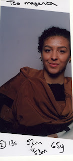
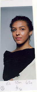
For my photoshoot I'm going to style a female model in second hand clothing that I have bought from charity shops in the Medway area. My idea is to layer different items of clothing to make a new garment, to represent how upcycling can also be used to recycle fashion. By layering recycled clothing on top of each other represents the mass consumption the fashion industry has because fashion is about the new trends which results in a lot consumerism and therefore waste. Having a model wear recycled clothing in a fashion photoshoot will raise awareness on how you can still be stylish by wearing second hand clothing. I'm going to present my images in a fashion editorial by layering my images on top of destroyed receipts for clothing, to again emphasise the amount of mass consumption there is in the fashion industry. By having the model in second hand clothing and still appearing fashionable can show how you don't need to continue buying new clothing. To show how fashion can be recycled in different ways I'm going to make a collage with my own images and with old fashion editorials from magazines, I was inspired by artists such as Arian Behzadi and Melinda Gibson who use collage in there work and layer different images on top of each other.


I wanted the clothing to be the main focal point of the photographs, to achieve this I used a plain background and layered numerous items of clothing on top of each other. I feel that the issue of recycled clothing is represented in the images I have created because of how I have dressed the model in second hand clothing. To add to the recycled theme I cut out images from old fashion magazines to recycle fashion in a different way, to make sure all the images work well together I made sure I cut them out in the same style. To improve my editorial I would make sure I kept a consistent style in all of the photographs as the lighting looks slightly different in all of the images. The most difficult challenge was printing, I found it hard to make all of the images have the same colour tones. I would place my work in a fashion magazine as I have made a fashion editorial that showcases second hand clothing. 

The Commission- Final Images

Contact Sheets


First Image
For the first test strip I set the lens on the enlarger to F16. I set the colour dials to 60 for magenta and 80. I exposed each section of the paper for five seconds. 
From the last test strip I decided to expose the next test strip for 7 seconds, however as I closed the aperture to F22 I have to double the time so it is 14 seconds. 
The last test strip looked too cyan so I decreased the magenta and yellow colour dials by five. I also increased the exposure time by 1 second.

For the next test strip I decreased the yellow colour dial to 71 as the image looked to cyan because I did this I had to change the exposure time back to 14 seconds so the image doesn't become too dark.

The test strip looked to dark so I changed the exposure time back to 13 seconds. I also decreased the yellow dial even more as the image still looks to cyan.
The test strip still looked to cyan so I decreased the yellow dial again to 65.
I felt the test strip looked to be correctly coloured balanced so I made the image into a final print.


Second Image
As I used a similar image to my first one, I kept the settings on the enlarger the same as it was for the final image. The enlargers aperture was set at F22, and I exposed the whole of the image for 13 seconds. The yellow colour dial was set to 65 and the magenta was set to 55.
I felt that the image looked to green so I decreased the magenta by 3 so it was 52. 

The test strip then became to magenta so I increased the magenta by one.
This test strip came out too dark so I decreased the exposure time by one second.
The image still looked magenta so I increased the magenta by one so it was 54. 


Third Image
I used the same settings as the ones I used for my first final print. I felt the image looked to yellow so I increased the yellow colour dial by 3.
The second test strip looked to bright so I added two seconds to the exposure time to make it 15 seconds.
I felt the image looked to magenta so I increased the magenta slightly to 55.5.
This test strip came our too cyan and too dark, I decreased the exposure time to 13 seconds and decreased the yellow colour dial to 65.
The next test strip looked too green to remove it I decreased the magenta colour dial to 52.
I felt the image looked too bright so I increased the exposure time by 1 second. 
Next the test strip came out too cyan again so I changed the magenta colour to 54.
This is the final test strip I made, I decided to make a final print of it to use in this project.


Tuesday 13 March 2012

The Commission- Collage

Photographers/ Artists that use collage

After my tutorial with Steffi I decided to change my idea slightly for 'The Commission project'. Instead of just using recycled clothing I'm going to look into a way to make my images more recycled. To do this I'm going to look into creating a collage using my own portrait images and fashion editorials from magazine to recycle photography as well as the clothes. Steffi also suggested using stitching and different ways I could make my images appear more recycled. 


Garrett Pruter
Garrett Pruter describes his artwork as being something that is “on the verge of being forgotten.” He makes collages that are intricately detailed using old photographs that are old family portraits or what he has collected from second hand stores. The images he creates have a nostalgic feel to them as they draw inspiration from the past. He fuses images together along with magazine images he has cut out to represent the short span photographs have. 


Christian L'Enfant Roi- Autumn/Winter 2012/13 
The Christian L’Enfant Roi Autumn/Winter 2012/13 ad campaign fuses there menswear collection with images of nature and urban areas. The cut out images make the ad campaign stand out which inspired me to cut out my own portraits and to add them to other images I found. By collagen images of people with natural and urban landscapes plays with human perception


John Stezaker
Stezaker creates art work out of images he found in books, magazines and old postcards. He juxtaposes them together and removes the images original context and conveys his own one. Im his series 'Marriage' he uses pictures of classic film stars and overlaps there faces which add a comical feel to them. Stezaker produces recycled work by using old images that would have been forgotten this method inspired me to use images in my own work from old magazines.


Hollie Chastain
Hollie Chastain creates abstract images by using old photography, ink and aged paper. Chastain cuts the people out from the images and places them on the yellow paper and decorates them with doodles and scribbles as she enjoys how all the materials interact with each other. When talking about her work she states that  “she creates a world of adventure and secrets open for the viewer’s interpretation.”
Melinda Gibson
Melinda Gibson creates carefully constructed collages out of her own photographic prints and images she has collected. When talking about her work she says : "I am interested in the changing perspectives of the photographic medium, how images are viewed and understood through the technological advances in photography and the help and hindrances this begins forth into our contemporary culture." This is represented in Gibson's work as images are layered and cut in a way that allows us to question reality. Gibson's work is very surreal as she uses colours, patterns and photograph to create images with a bizarre context.


Bobby Neel Adams
Bobby Neel Adams terms his work as 'Photo-surgery' as he alters portraits by using a collage technique.  HIs work looks at the transformation of the human body by getting older and circumstances. Adams takes the portraits on film and then merges two of the portraits together by cutting the subjects in halve. The outcome are these very bizarre portraits that at first look as if they are one person but in fact are of two different people merged together. 


Arian Behzadi
Arian Behzadi collages old newspaper clippings and vintage inspired fashion portraits together to create a new fashion image. This series of work appealed to me because of how the photographer has recycled old newspaper clippings to create a piece of art, the images gave me an idea to use receipts from purchased clothing instead of the newspaper background to emphasise mass consumption in the fashion industry. By overlapping images creates a very vibrant and dramatic picture as you can't help but wonder what each section of the collage is about. 


Yelena Yemchuk
Photographer Yelena Yemchuk created a fashion editorial for the 6th issue of Tar Magazine. The editorial was called ‘Décolletage Extreme' and features model that has been styled by using other images in a collage way. The images have a very surreal and dream like feel to them as Yemchuk has placed objects we see everyday in different places and in a different context such as having a glove placed on the models head. I love the idea of layering different images together as it means you are recycling images to create art work.


Pierre Debusschere

Photographer Pierre Debusschere created an editorial called 'The Day The World Went Away’. It features model Yannick Abrath in a collage style effect and creates a relationship between humans and nature by projecting natural landscapes on the model. By layering another image on top of the portrait creates a very dream like picture and gives the portraits a very surreal feel. 


Cut-out
One of my idea's was to cut out my own photographs so I can turn them into a collage with fashion photography from old magazines so I recycling fashion in two different ways. 


Onur Dogu - Kerem Tezgel Spring/Summer 2012
Kerem Tezgel Spring/Summer 2012 Pre-Collection cookbook is presented in a cut out style. The images were taken by photographer Onur Dogu and features models in sports wear inspired clothing.  By making the images look as if they have been cut out makes them look very dramatic and makes them stand out. It also makes the images look as if they have been recycled from another magazine which is the effect I want to create in my own work.


Stitching
I decided to research into artists who have used a form of stitching in there art work. As my images are about second hand fashion and mass consumption in the fashion industry I felt that the use of stitching in my work will emphasise the fashion aspect of my work.  


Val Britton

Val Britton creates collages that mimc the visual language seen in maps. They are made by connecting pieces of paper together by drawing, painting or by using collage. Britton also uses methods such as stitching, printing, and staining the canvas. Britton's aim is to connect to his dead father by his artwork. The images have a dreamy feel to them however they are also very structured because of the line work.

Matthew Cox

'Embroidered X-Rays' is  a series of work by artist Matthew Cox. The work consists of x-rays which are partially covered by embroidery. X-Rays are usually seen as being depressing however Cox brings them to life by adding colour to them and by giving a narrative and personification to the person who owns the bones. When talking about his work Cox says “For me, stitching has a nurturing aspect and acts as care giving or healing to the injured, a socially feminine sort of action, while the x-ray itself can be considered masculine and unemotional.” By using two different materials he has created an interesting mix of masculine and feminine. 

Inge Jacobson & Sebastian Faena
Artist Inge Jacobson and photographer Sebastian Faena worked together to create cross- stitch fashion photo's. It took Jacobson over 2'000 hours too complete the series of images, the result is images that have a very intricate feel as there is a lot of attention to detail. This series is a reinterpretation of Sebastian Faena's Fall/ Winter 2011 campaign, it brings to life the images because of how intricate they are. The images highlight the lost art of cross-stitching and shows how they can still be used in modern day life.