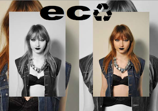
Our idea for the back cover was to use the same images as we used for the front cover so it’s as if the reader has done a full circle to represent recycling. The repetition of the images symbolises recycling and upcycling to give the audience an impression that they are recycling the magazine by going back to the beginning. This idea was inspired by the back pages in Positive magazine as they look very similar to the front cover and look as if they could be the front page of the magazine. On Photoshop I made the front cover by applying four of the same images to a blank A4 page, two were in colour and the other two were in black and white to make the page stand out. To make the back cover slightly different I flipped it horizontally on Photoshop.


No comments:
Post a Comment