- Concept
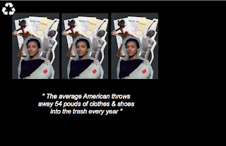
The title of this article and images is called 'Fast Fashion'. We decided on this name as my images looks into mass consumption in the fashion industry and how buying second hand clothing should be encouraged. My images are in the style of a collage, by placing my images with cut outs from old magazines demonstrates how you can recycle fashion in more then one way, the receipts I used represent the mass consumption in the fashion industry as I have used a lot of them in my work.
- Page Layout
For the page layout we was inspired by Positive magazine and how on one of there pages they repeat some of there images, we decided to use this technique on this page as it symbolises the images being recycled and reused. The images had a black background so we decided to make the whole page black as we noticed it was often used in Positive magazine and made the pages stand out. To merge the plain white pages in with the black, we began and ended the article pages with a black strip on a white page so the magazine flows together. We decided to line up the images so they were all the same size so that they are in the style of pictures from Positive magazine. Too add interest to the page we made the images start from a different side on each page.
- Article
The article we choose to go with the images is called 'Yes- even clothes can be recycled', which discusses how Americans are buying and getting rid of clothes quicker then ever and how there are more options besides throwing away clothing such as charity shops. The article suits the theme of our magazine as it talks about how recycling helps the environment and encourages the audience to recycle there clothing. We decided to have the text in white so it contrasts against the black background which makes it stand out and as to match the colour scheme of the rest of the magazine.


No comments:
Post a Comment