Front cover
We wanted the front cover on our magazine to stand out and catch the audiences eye. The front cover of 'Vnfold' magazine inspired us with how they have layered images on top of each other which makes the cover look very eye catching. The photography and art direction is by Antonella Arismendi, we liked the minimalistic feel of the images and how there is no text on the cover apart from the name of the magazine. The idea of layering images on top of one another represents the idea of recycling and how we are making sure we use all of the images and nothings going to waste. We are going to make the images spread across the whole of the page to show how we are not wasting space on the paper to go with the theme of having no waste in fashion. The images we decided to go on the front cover are by Katie Joiner, they are very powerful images and appear very modern with the models poses and styling. We also decided to use these particular images as the model is wearing necklaces made from old car parts which represents the magazines theme of recycling and upcycling clothing. We wanted the front cover to look very minimalistic to make the image and the title of the magazine the main focus so we choose not to include any other text apart from ‘eco’ the magazines name. Front covers by magazines Elle and Blend inspired us to design a minimal front cover.


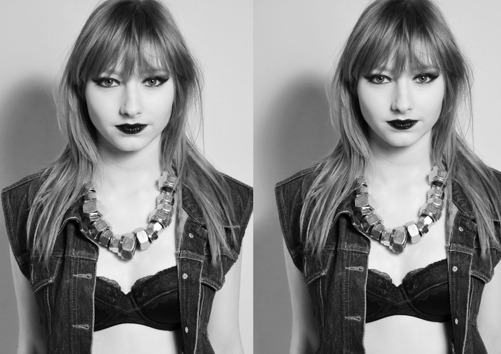
We decided to use this image as the front cover as we liked how the model is looking directly at the audience which gives the image a dramatic feel. I experimented on photoshop with different ideas we could use for the front cover. First I changed one of the images to black and white and applied the image twice to an A4 document, I liked the repetition of the image however I didn't think it was strong enough. With the next image I kept the same two black and white images as before but this time I applied the same image in colour twice to the photo and placed them on top of the other images. This made the cover much more powerful however I didn't like how the images were repeated again with exactly the same technique so I made one of the background colours to colour and changed the image placed on top of it to black and white.


This is our final front cover for our magazine :

No comments:
Post a Comment